
The Marketplace Guide
Black, Gold And Ivory Styling


01 · Warmth. Contrast. A Little Glow.
Let One Color Lead
Choose a main color and use the others as supporting notes. A mostly ivory setting feels different from a mostly black one, even with the same accents.
The proportion of colors sets the mood. An ivory background with a black detail and a little gold feels lighter than a black background with the same accents. Choose the balance that suits your room and the way you want it to feel. You can begin with surfaces and fabrics you already own rather than replacing them. A small new object may be enough to make the palette more visible.
Try This At Home: Write down the one quality that matters most to you, then a practical limit such as size or placement. Keep those two notes together while you browse. This makes it easier to recognize a promising option without expecting it to satisfy every possible idea. If a piece catches your attention for a different reason, pause and consider whether that new direction still fits your plans.
A Simple Starting Exercise: Picture the place or person you are shopping for and write down three things you already know. They might be the available space, a favorite color, and the way the object will be used. Then name one thing you are open to discovering. This separates practical needs from creative possibilities. Keep the note short enough to use while browsing; it should help you notice things, not distract you from them. If a find falls outside your first idea, compare it with those practical needs before dismissing it or deciding too quickly. You can change your mind about the creative direction while still respecting the limits that matter. The result is a flexible brief that belongs to you, rather than a list borrowed from someone else’s room or photograph.
Explore This Idea ↗
02 · Warmth. Contrast. A Little Glow.
Use Metallics As An Accent
A metallic finish catches the eye quickly. A small amount can be enough, especially when the surrounding surfaces are quiet.
Metallic finishes attract attention because they reflect light differently from matte surfaces. Notice where the light comes from and how bright the reflection becomes. A muted brass-like tone may feel quieter than a highly polished gold finish. Neither is automatically better; the useful question is how it sits among your other choices. Ask about the actual material and finish if that affects your purchase, because an image alone may not distinguish them.
A Useful Comparison: Look at the piece beside the colors and materials already in your space. Consider the view from across the room as well as the close-up details. The relationship between objects often matters more than any one item on its own. If you are browsing online, use the imagery for inspiration and ask the shop about the actual item before relying on a specific visual detail.
Look At The Whole Relationship: Imagine the proposed piece in its intended setting, including the objects that will remain around it. Consider what you would see first, what would become less noticeable, and whether the balance would change in a way you enjoy. If you can, take a photograph of the current arrangement and mark where the new object might go. This is only a rough visual aid, not a way to establish exact size or color. Use real measurements and shop-confirmed details for those questions. Move one existing item in the photograph or in the room before considering another purchase. Sometimes the useful change is a different relationship between things you already have. A new find can then add something specific instead of being asked to solve an unclear styling problem.
Explore This Idea ↗03 · Warmth. Contrast. A Little Glow.
Soften Contrast With Texture
Linen, wood grain, and softly textured ceramics can make a strong palette feel more relaxed. Think about touch as well as color.
A strong contrast can feel softer when the materials have visible texture. Ivory linen, dark wood grain, and a gently irregular ceramic surface bring variation without requiring another color. Consider how the pieces feel as well as how they look. A room used every day benefits from materials that suit your routines. The palette can remain elegant while the arrangement feels relaxed, familiar, and easy to enjoy.
Keep It Practical: Leave room for the way the space is used every day. An arrangement should allow you to reach what you need, move comfortably, and care for the objects without difficulty. If a choice adds inconvenience, consider a different placement before deciding. A small adjustment can sometimes make an interesting object work much better with the life already happening around it.
Test The Everyday Fit: Think through an ordinary day in the place where the item will live. Notice what you reach for, where you set things down, and which areas need to stay clear. Include other people who use the space rather than judging only a still photograph. A decorative choice should leave those routines workable. If the piece is a gift, consider the same questions from the recipient’s point of view and avoid assuming that they can rearrange a whole room to accommodate it. You can also try a temporary arrangement with an object of roughly similar proportions, provided it is stable and safe to place there. The experiment does not need to look beautiful. Its purpose is to show whether the proposed position, footprint, and everyday use make sense together.
Explore This Idea ↗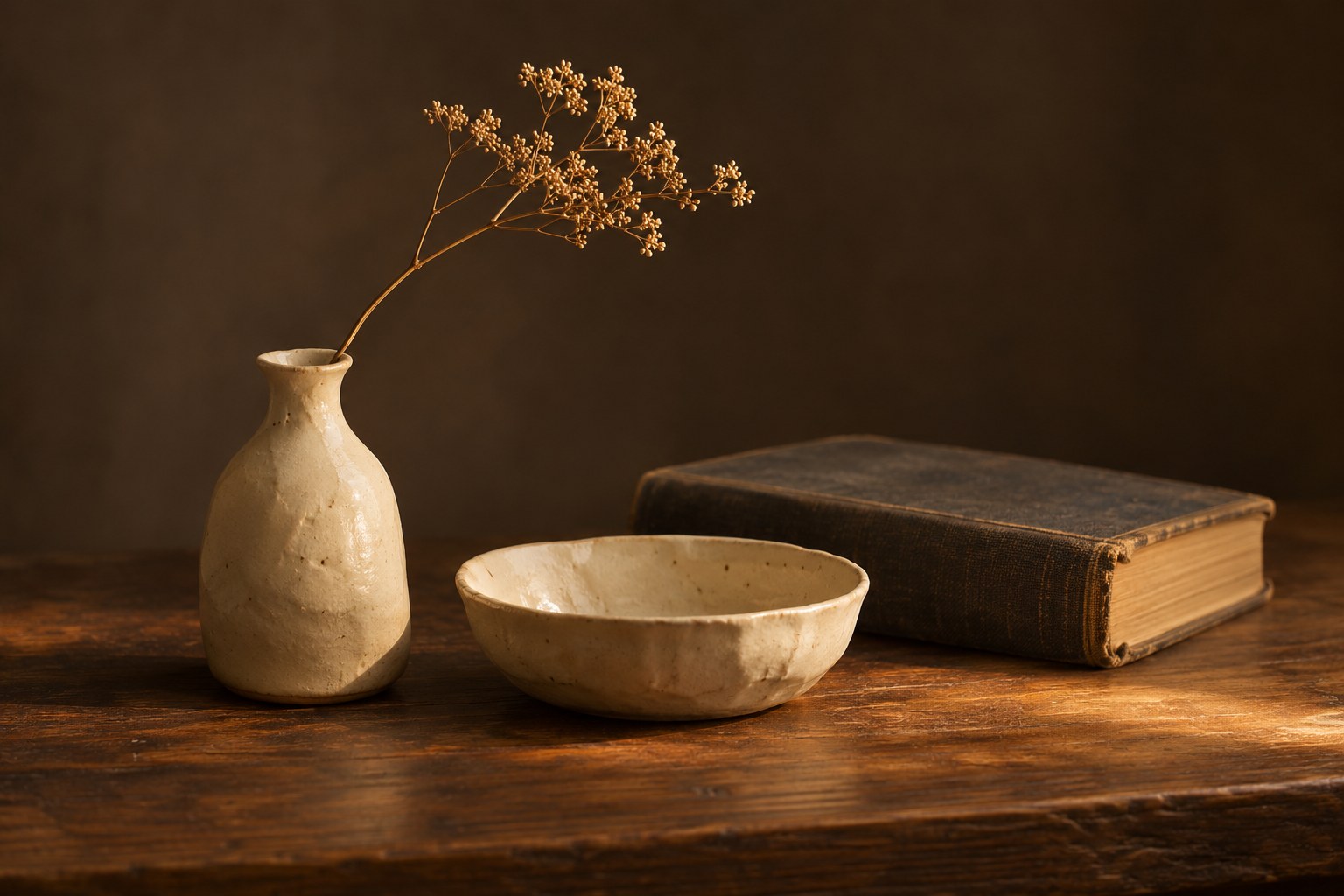
04 · Warmth. Contrast. A Little Glow.
Notice Warm And Cool Undertones
Ivory can lean yellow, pink, or gray, while gold finishes range from bright to muted. Compare actual samples in the light where the pieces will live.
Undertones are easiest to compare side by side. A warm ivory can look quite different next to a cool white, and two gold finishes may have noticeably different warmth. Bring a small sample or a clear photograph if a close relationship matters. View the actual item under ordinary light when possible. There is no need for perfect matching, but it helps to know whether a difference is one you enjoy rather than one you discover unexpectedly.
Before You Decide: Make a short list of the unanswered questions that would affect your choice. Ask those questions directly and use the current item name in your message. You do not need every possible detail, only the ones that matter to your plans. The shop can confirm what is known about the actual item, including details that cannot be established from an illustrative photograph.
Make The Question Easy To Answer: Start with the current item name, then describe the one detail you need and why it matters. For example, you might need a measurement because the piece must fit beneath a shelf, or a clear view of the finish because it will sit beside an existing object. This context helps the shop provide a useful answer without guessing what you mean. Keep separate questions distinct and allow for details that may not be documented. If something cannot be confirmed, decide whether that uncertainty affects your willingness to buy. Do not turn an illustrative detail or an earlier assumption into a confirmed fact. The aim is a shared understanding of the actual item, so that your final choice rests on information you have deliberately checked.
Explore This Idea ↗05 · Warmth. Contrast. A Little Glow.
Make The Palette Your Own
Use the palette as a starting point rather than a rule. A small pink accent or a personal object can give the arrangement its own character.
A restrained palette can make room for a personal exception. A pink accent, a favorite book, or an object with a memory attached can add warmth and individuality. Try one change at a time and see whether it makes the arrangement feel more like you. The palette is a useful guide, not a requirement to hide everything that does not fit. A personal home can be visually coherent and still hold a few surprises.
Your Next Step: Browse the current catalog or contact Hive Marketplace with a specific question. If you are planning a visit, check current hours and availability first. These guides offer ideas for making a personal choice; they do not promise that every object shown in the styling images is stocked. Let the current listing and the shop’s confirmation guide the final decision.
Bring The Decision Together: Return to the reason the item interested you and compare it with what you have learned. Does it still fit the space, person, or purpose you had in mind? Are the important practical questions answered? Have you confirmed the current price and the next step with the business? You do not need to find a perfect object for every possible future use. You need a choice that feels comfortable for the use you have now. If you are still unsure, identify the specific missing detail rather than collecting more general inspiration. Contact the shop about that detail, or take time to consider the decision. When you are ready, follow the current purchasing process and keep any confirmation provided. A thoughtful choice can still feel spontaneous and enjoyable.
Ask The Shop ↗Follow Your Curiosity